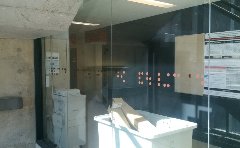
I audited a few lectures of a course put on by the Manitoba Centre for Health Policy this fall. It was held in the Apotex Building on the Bannatyne Campus of the University of Manitoba. On the way to class I saw these dots on a glass wall.


“of pharmacy faculty of”
They are Braille, and they read “faculty of pharmacy”. I can’t figure out where they are going with this. The writing isn’t really tactile, beyond the feeling of a vinyl sticker on glass. The writing is WAY bigger than normal braille, the letters are about 8″ tall. Being on a glass wall, it’s backwards from the direction you would enter from. They are about the same height of the ground that braille door signs would usually be, which makes me wonder if this is a tongue in cheek response by someone being forced to put a standardized sign on a glass wall that might look better without it. Or, was it just put there so no one runs into it?
Another possibility is that the pharmacists wanted a memorial of their previous status as a Faculty – they are now College of Pharmacy at the Faculty of Health Sciences.
Does anyone know more about this?