I love my bacon and eggs, but I am not sure if this one loves me back…
Category for snapshots

Or make it sleep.
Or make it go together.
Or make it come apart.
Or make it flat.
Or…
Maybe I should have bought it.
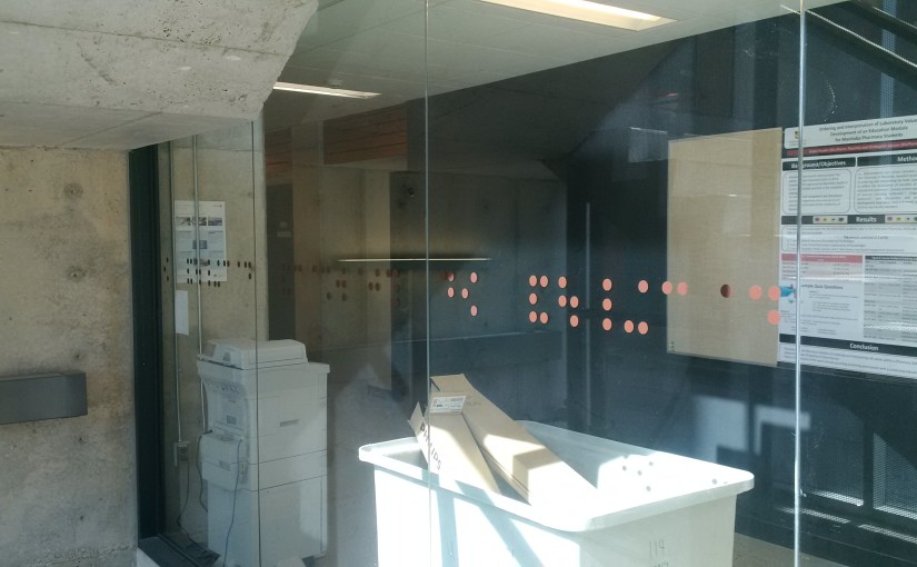
I audited a few lectures of a course put on by the Manitoba Centre for Health Policy this fall. It was held in the Apotex Building on the Bannatyne Campus of the University of Manitoba. On the way to class I saw these dots on a glass wall.


“of pharmacy faculty of”
They are Braille, and they read “faculty of pharmacy”. I can’t figure out where they are going with this. The writing isn’t really tactile, beyond the feeling of a vinyl sticker on glass. The writing is WAY bigger than normal braille, the letters are about 8″ tall. Being on a glass wall, it’s backwards from the direction you would enter from. They are about the same height of the ground that braille door signs would usually be, which makes me wonder if this is a tongue in cheek response by someone being forced to put a standardized sign on a glass wall that might look better without it. Or, was it just put there so no one runs into it?
Another possibility is that the pharmacists wanted a memorial of their previous status as a Faculty – they are now College of Pharmacy at the Faculty of Health Sciences.
Does anyone know more about this?
The writing on the spines of continental European and south American books generally faces up (tilt your head left to read), the writing on north American and other English language books down (tilt head right).
That sent me on today’s wiki wander.
One reasons given for the US way are a book lying face-up will have the spine in the right direction to be read (a continental book’s title would be upside down).
Another reason is that, to walk down the usual left-to-right direction of a shelf, one is going forward rather than backwards as one would be reading the continental style.
A reason for the continental way would be that, books of a series (eg multi-band encyclopedias) would be read in order when faced this way.
Another one is that the left-tilt of the head when reading continental-style titles puts the (statistically more likely dominant) right hand in a more ergonomic position to reach for the book. And, of course, walking past a continental shelf, the titles will stream past like the intro on Star Wars, so that must be the right way…
Actually, Star Wars or not, it turns out there has been a standard for this (ISO 6357) since 1985. It says that titles should be written the north American way, facing down. Looks like this is one of the few ways where the standard-loving Germans have not jumped on board and implemented it. Makes me wonder why, but there were no good explanations in the wandering.
Some part of me now wonders if this different direction, and the different head tilting that goes with his, could have any relationship to our reception of the book. Could our head tilting to read the title lead to a different brain hemisphere being active in analyzing and choosing titles? Could it be that the left-tilting Germans are so literal and exacting because of the way they have always needed to lean to choose their books? ;-)
Amazing what kind of specialized tools are out there. It’s a telescoping stick you put into the bowl of the toilet so you have an ergonomic handle to lift it. Part of me wants to ridicule it, and another part thinks that if I had to install 20 toilets a day I’d want one.


We have wrens nesting in the yard. At this stage they seem to have no sense of self preservation. This little guy let me get to within about 15 inches of him. He still didn’t hide then but I got worried that one of his parents would come and poke out my eyes, so I let him be.